Explore the vibrant world of color theory with our comprehensive guide. Understand the color wheel, primary, secondary, tertiary, and complementary colors.

In the vibrant world of design and art, color plays an integral role. It's the silent yet powerful communication tool that can influence mood, evoke emotions, and make statements. To understand and harness the power of color, we delve into the basics of color theory, the color wheel, and the concept of complementary colors.
Color theory is a conceptual framework used in visual arts and design that explains how colors interact with each other and how they can be combined to create harmony. It's a set of principles used to create an aesthetic and emotional response in the viewer.
Color theory begins with the color wheel, a tool that illustrates the relationships between primary, secondary, and tertiary colors. Understanding these relationships is key to mastering color theory and effectively using color in your work.
The color wheel is a circular diagram that represents the relationships between different colors. It was developed by Sir Isaac Newton in 1666 and has been used by artists and designers ever since to understand and manipulate color.
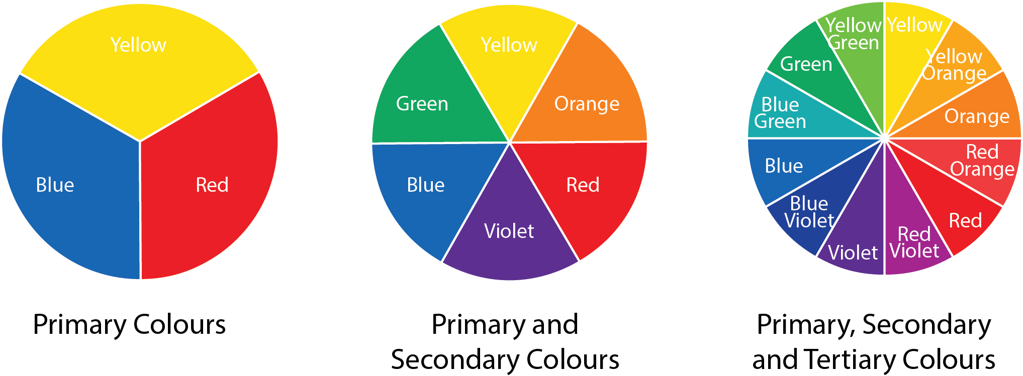
At the core of the color wheel are the primary colors: red, blue, and yellow. These colors are the building blocks of all other colors and cannot be created by mixing other colors.
Secondary colors are created by mixing two primary colors. They include green (blue + yellow), orange (red + yellow), and purple (red + blue).
Tertiary colors are created by mixing a primary color with a secondary color. They include red-orange, yellow-orange, yellow-green, blue-green, blue-violet, and red-violet.
One of the most important aspects of the color wheel is the concept of complementary colors. These are pairs of colors that are directly opposite each other on the color wheel. When placed next to each other, complementary colors create a vibrant contrast, making each color appear brighter.
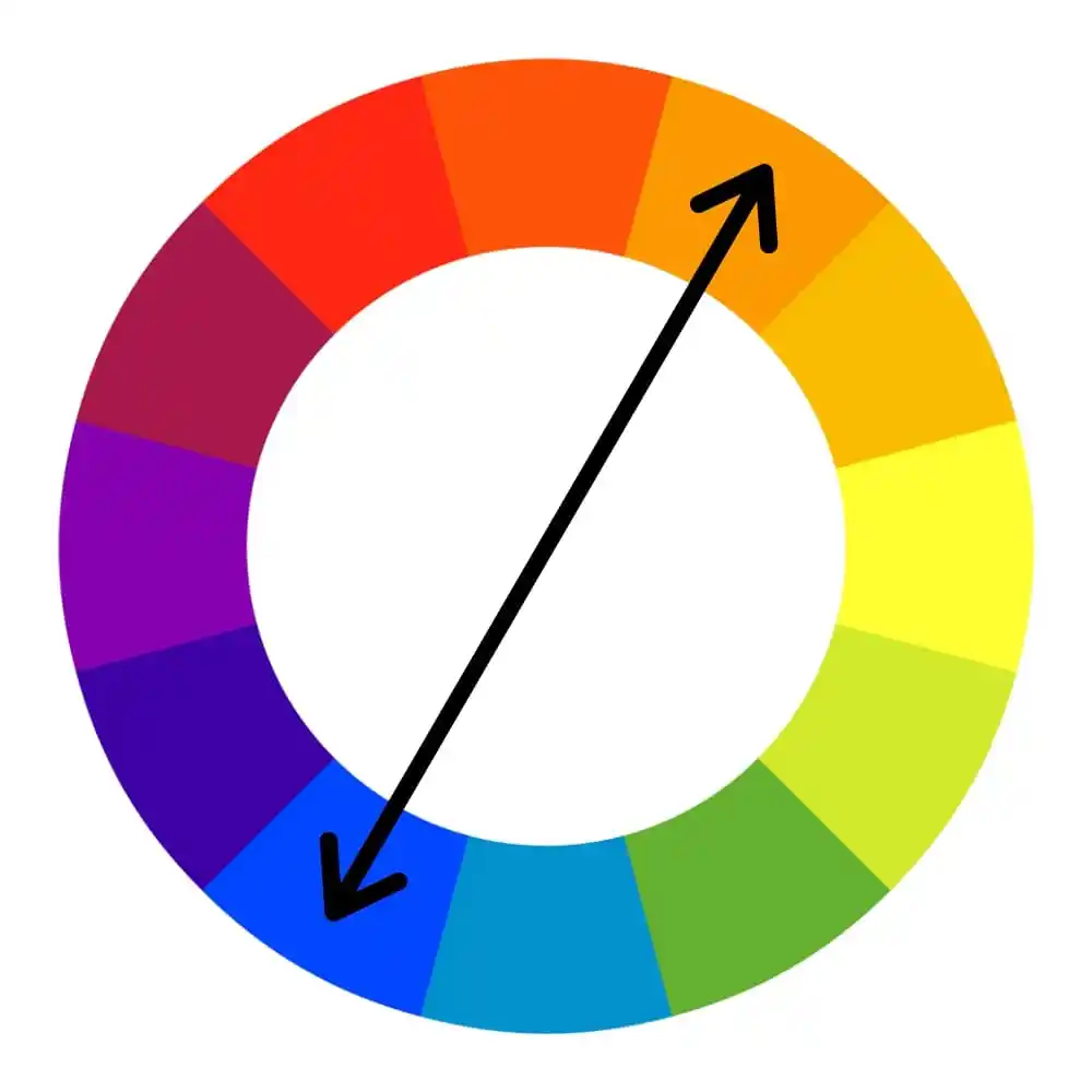
Complementary colors are a powerful tool in design and art. They can create a strong visual contrast, draw attention, and make elements stand out. However, when used in large amounts, they can also be jarring to the eye. The key is to balance them with neutral colors or use them sparingly for accents.
Let's explore how to use complementary colors in practice by answering some common questions:
Colors that Complement Blue: The color that complements blue on the color wheel is orange. This is because orange is directly opposite blue on the color wheel. Using these two colors together can create a vibrant and energetic design.
Colors that Complement Green: The color that complements green on the color wheel is red. This pairing can create a bold and high-contrast design.
Colors that Complement Red: The color that complements red on the color wheel is green. This combination is often associated with holiday themes due to its high contrast and vibrancy.
Colors that Complement Pink: The color that complements pink on the color wheel is a shade of light green or mint green. This pairing can create a soft, romantic, and fresh design.
Colors that Complement Brown: Brown is a neutral color that can be complemented by a variety of colors, including lighter neutrals like beige and taupe, or a contrasting color like blue or teal.
Colors that Complement Purple: The color that complements purple on the color wheel is yellow. This combination can create a rich and royal design.
Understanding the color wheel, color theory, and complementary colors is essential for anyone involved in art, design, or any field that uses color. It allows you to create color schemes with a specific mood or emotion in mind, and it can help you create more visually appealing designs.
Remember, while these rules and theories provide a good starting point, the most important thing is to experiment with color and develop your unique color sense. After all, color is a powerful tool for communication, and understanding its principles can help you use it more effectively.